

[Component&Storybook] Progress - Bar&Step
Budget: $49 – $50 USD
【Notice】
1. We have a lot of development work, considering technology, quality, schedule and price stability, we prefer to find long-term cooperation with frontend teams, please let me know how many Frontend Teammates you have that can cooperate for a long time
2. We don’t want to wast two parties time, please check you have skill to complete this job :
1. Technical ability is insufficient, the project will be cancelled and no pay but disput ,If necessary, the code you wrote will be published.
2. Minor problem, front-end team will discuss with you until it is completed.
3. Done very well, it will become our long-term outsourcing
---
【Provide First】
Please provide the react storybook reference you ever do before.
This is testing project, this is exist component and job demand is update the UI ,not from scratch.
And all the UI we will update asap , and we want to check the developer has expirence and the refernfce.
# Project
---
## Deadline
Deadline need to push the code.
-2022/10/19 14:00 (GMT+8)
---
## Supreme Principle
- egroup-material components are used in the project , we will update the compoents first then we can upgrade it in each project directly by yarn install.
- if the components already exists , update the UI and UX fo the existing components instead of creating a duplicate components.
---
## Description
A clear and concise description of what the problem is.
- [ ] New Components
- [ ] Structure :
- components/Progressbar
- Default
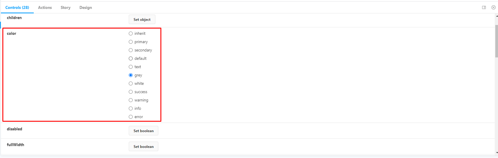
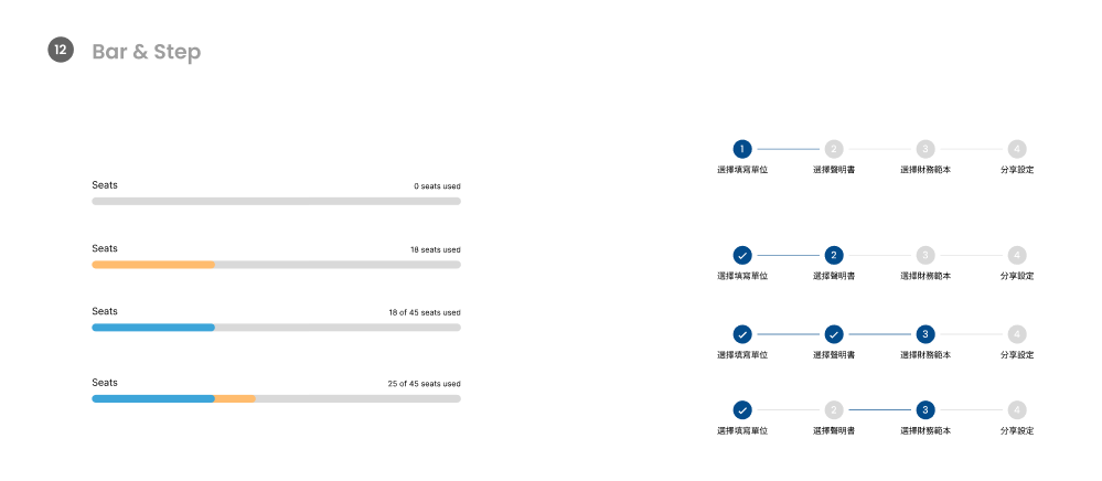
- [ ] Need a variable can control the diffrient type of UI like the button
- 
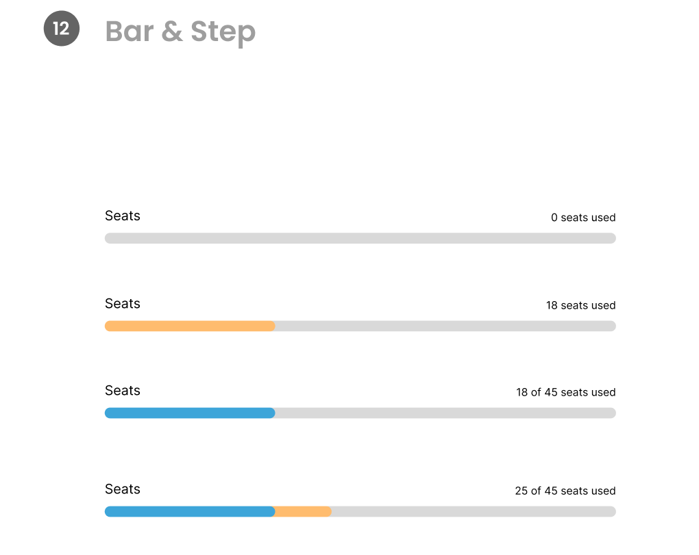
- For example
- when you change the number of seats used , will show diffrient color type of progressbar
- 
- [ ] Exist component , need you update
- [ ] Structure :
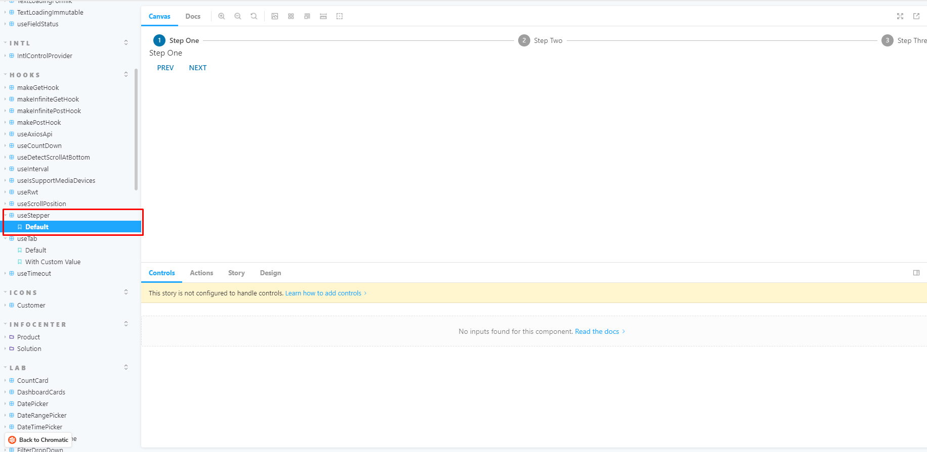
- hook/useStepper
- Default
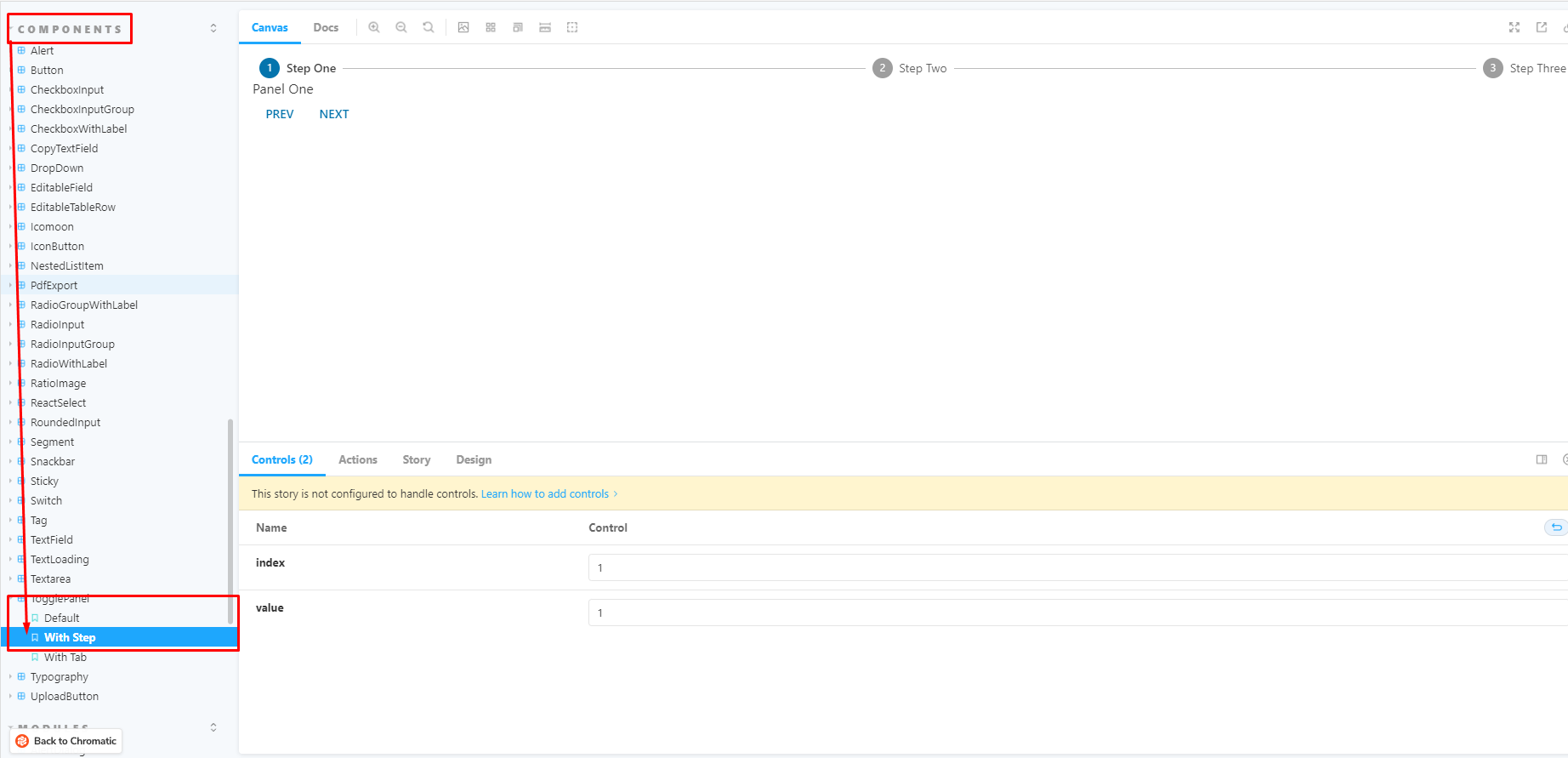
- components/toggelPannel
- WithStep
- [ ] Component Update
- package path screenshot
- [ ] Storybook Update
- [Storybook](https://6315727d26061e4ff69beeea-pjpjnycucp.chromatic.com/?path=/story/hooks-usestepper--default)
- 
- [Storybook](https://6315727d26061e4ff69beeea-pjpjnycucp.chromatic.com/?path=/story/components-togglepanel--with-step)
- 
- Design
- [Figma](https://www.figma.com/file/OlUxH6H4u3DLEmeytXgNkV/Infocenter-UI-Kit?node-id=599%3A1731)
- 
---
# Resources
## Figma
- [Figma](https://www.figma.com/file/OlUxH6H4u3DLEmeytXgNkV/Infocenter-UI-Kit?node-id=397%3A3119)
## Storybook
- [Storybook-Chromatic](https://6315727d26061e4ff69beeea-lfqjbcdfze.chromatic.com)
---
# Acceptance
## Function Review
- [ ] Follow the naming, package's structure ,
- [ ] Follow the UI Design
- [ ] Follow the UX Prototype Design
- [ ] Implements each status of the component
- [ ] Sync With Figma
1. We have a lot of development work, considering technology, quality, schedule and price stability, we prefer to find long-term cooperation with frontend teams, please let me know how many Frontend Teammates you have that can cooperate for a long time
2. We don’t want to wast two parties time, please check you have skill to complete this job :
1. Technical ability is insufficient, the project will be cancelled and no pay but disput ,If necessary, the code you wrote will be published.
2. Minor problem, front-end team will discuss with you until it is completed.
3. Done very well, it will become our long-term outsourcing
---
【Provide First】
Please provide the react storybook reference you ever do before.
This is testing project, this is exist component and job demand is update the UI ,not from scratch.
And all the UI we will update asap , and we want to check the developer has expirence and the refernfce.
# Project
---
## Deadline
Deadline need to push the code.
-2022/10/19 14:00 (GMT+8)
---
## Supreme Principle
- egroup-material components are used in the project , we will update the compoents first then we can upgrade it in each project directly by yarn install.
- if the components already exists , update the UI and UX fo the existing components instead of creating a duplicate components.
---
## Description
A clear and concise description of what the problem is.
- [ ] New Components
- [ ] Structure :
- components/Progressbar
- Default
- [ ] Need a variable can control the diffrient type of UI like the button
- 
- For example
- when you change the number of seats used , will show diffrient color type of progressbar
- 
- [ ] Exist component , need you update
- [ ] Structure :
- hook/useStepper
- Default
- components/toggelPannel
- WithStep
- [ ] Component Update
- package path screenshot
- [ ] Storybook Update
- [Storybook](https://6315727d26061e4ff69beeea-pjpjnycucp.chromatic.com/?path=/story/hooks-usestepper--default)
- 
- [Storybook](https://6315727d26061e4ff69beeea-pjpjnycucp.chromatic.com/?path=/story/components-togglepanel--with-step)
- 
- Design
- [Figma](https://www.figma.com/file/OlUxH6H4u3DLEmeytXgNkV/Infocenter-UI-Kit?node-id=599%3A1731)
- 
---
# Resources
## Figma
- [Figma](https://www.figma.com/file/OlUxH6H4u3DLEmeytXgNkV/Infocenter-UI-Kit?node-id=397%3A3119)
## Storybook
- [Storybook-Chromatic](https://6315727d26061e4ff69beeea-lfqjbcdfze.chromatic.com)
---
# Acceptance
## Function Review
- [ ] Follow the naming, package's structure ,
- [ ] Follow the UI Design
- [ ] Follow the UX Prototype Design
- [ ] Implements each status of the component
- [ ] Sync With Figma